QCharge EV App Experience Design Project
Electric vehicle charges are divided into slow (AC) and fast (DC) charging. Our challenge in this project was to meaningfully separate the pins on the map. Each pin represents a charging station. Some stations may have AC, and some may have DC, and others both.
RESEARCH
Benchmark
The use of electric vehicles has yet to be widespread in Turkey. When we started the project, there was a prominent competitor in the sector, and then it began to increase. For this reason, it was a new area we needed to learn about. To better understand user problems, we examined many global examples, read many case studies, and conducted netnography studies.
RESEARCH
Customer Journey Map & Empathy Map

We could not do fieldwork because the physical stations were not ready when designing the application. Based on our research, we created an empathy and customer journey map to better understand the user's charging process from start to finish. We then discussed these with the client.
RESEARCH
User Flows

In the process, we realized that there were too many unanswered questions. That's why we wanted to better understand the experience before moving on to the WF process. We studied low-fidelity flows we thought we needed to understand fully and discussed them with the customer. Thus, we have analyzed technical constraints or edge cases we have yet to consider.
RESEARCH
Understanding Field Experience

Finally, we rented an electric vehicle and experienced the booking and charging ourselves. We have also seen many useful findings in our own experiences.
RESEARCH
UX Strategy
Decision Making
1- Making Conscious Choices
How does the flow progress, and how does the user process the information?
2- Creating Familiarity
The primitive brain prefers to stay safe and resorts to Familiarity.
3- Managing Cognitive Load
Offering choices that don't require much cognitive effort
4- Appealing to the Emotions
We can offer small but essential, subtle but visible, effective impulses and triggers that provide a "happy path" for the user.

DESIGNS
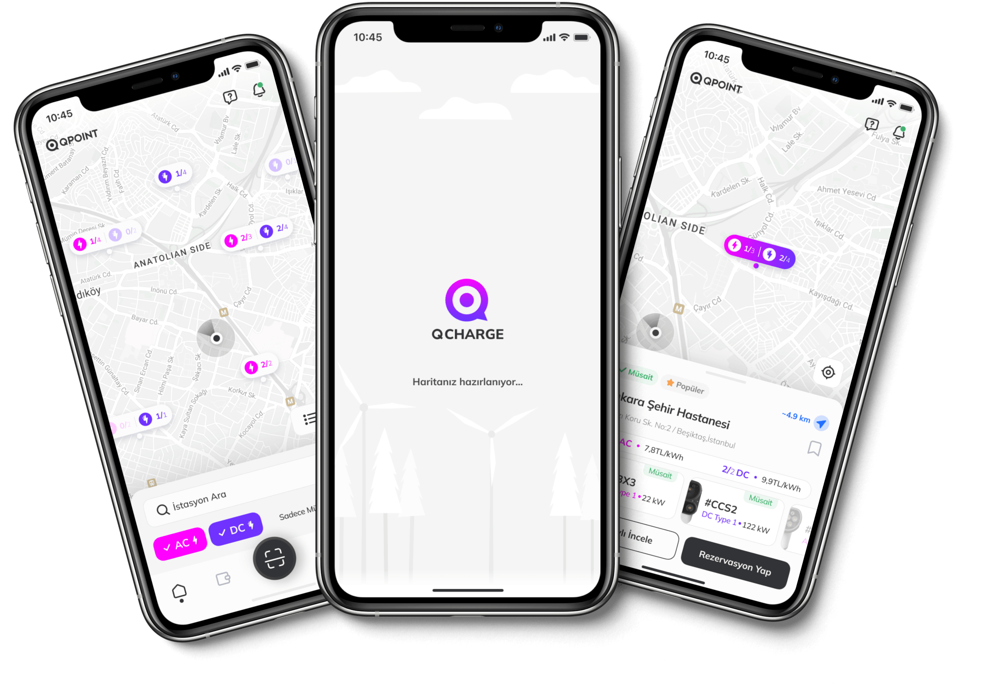
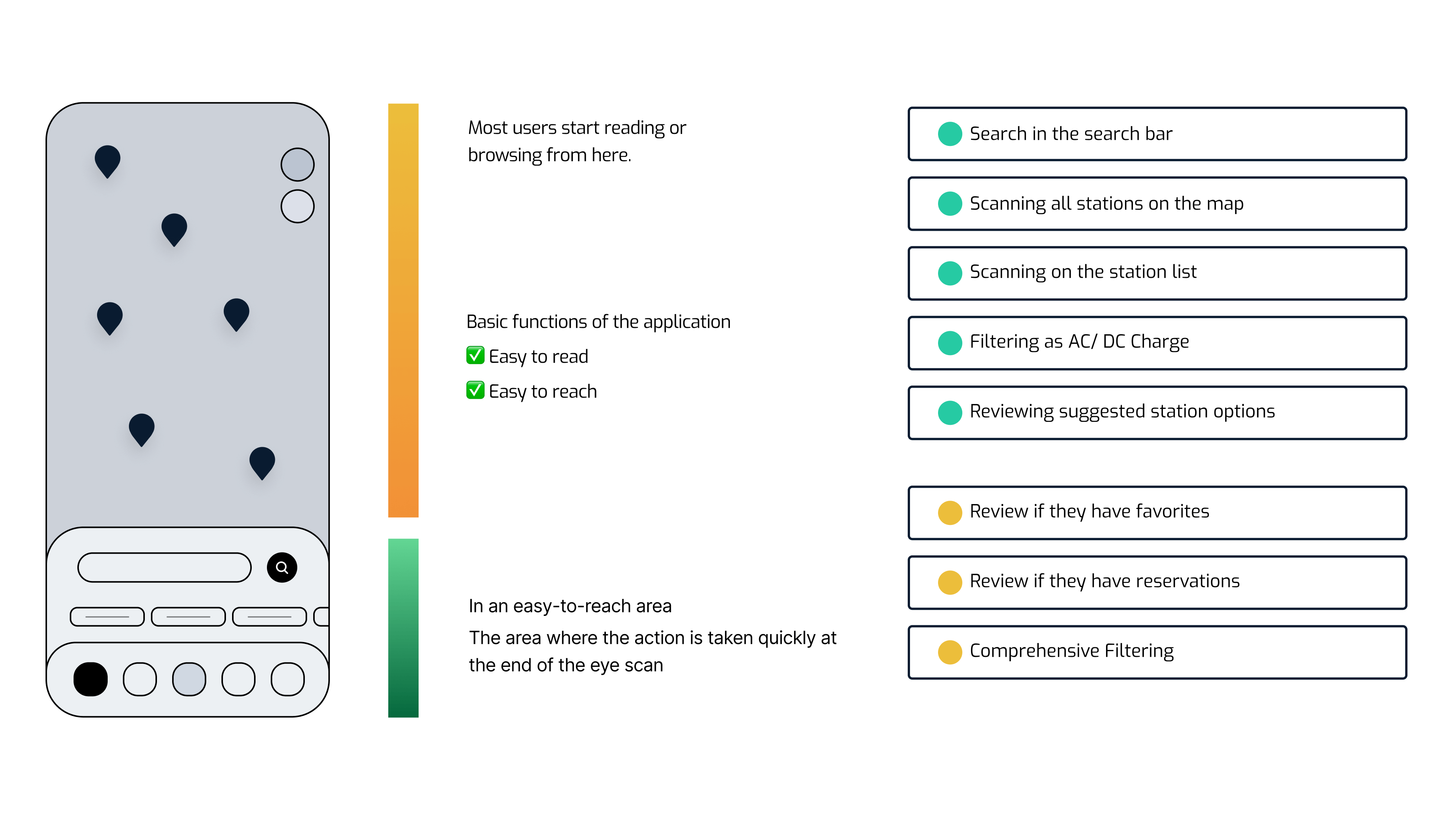
Map

AC and DC charging stations can be filtered with tags on the map. The pink color represents AC charges, and the purple color represents DC charges. When the switch is turned on, available stations are displayed.

Besides the map view, switching to the list view with the floating button is possible. We designed a list card with information consistent with the pin information selected on the map. When users select the station pin, they can see in detail which sockets are available in the station and their availability status, apart from the location information.
Since the socket heads can make a difference according to the vehicle models, we wanted to give them their visuals. The user can get detailed information by going to the station detail page or going to the reservation flow as the main action.
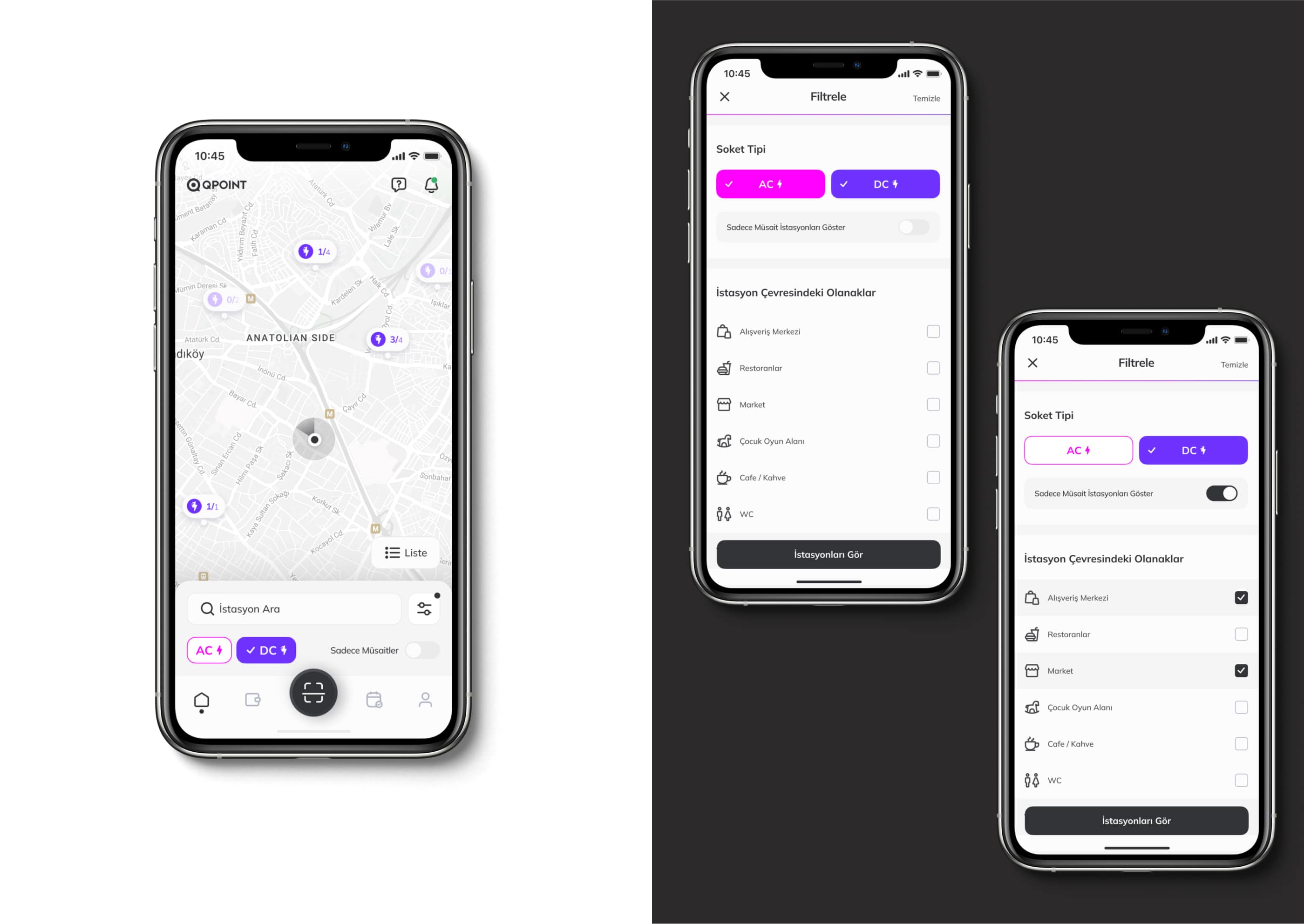
We see a consistent transition with the drawer structure on the map and filtering page.
DESIGNS
Station Detail
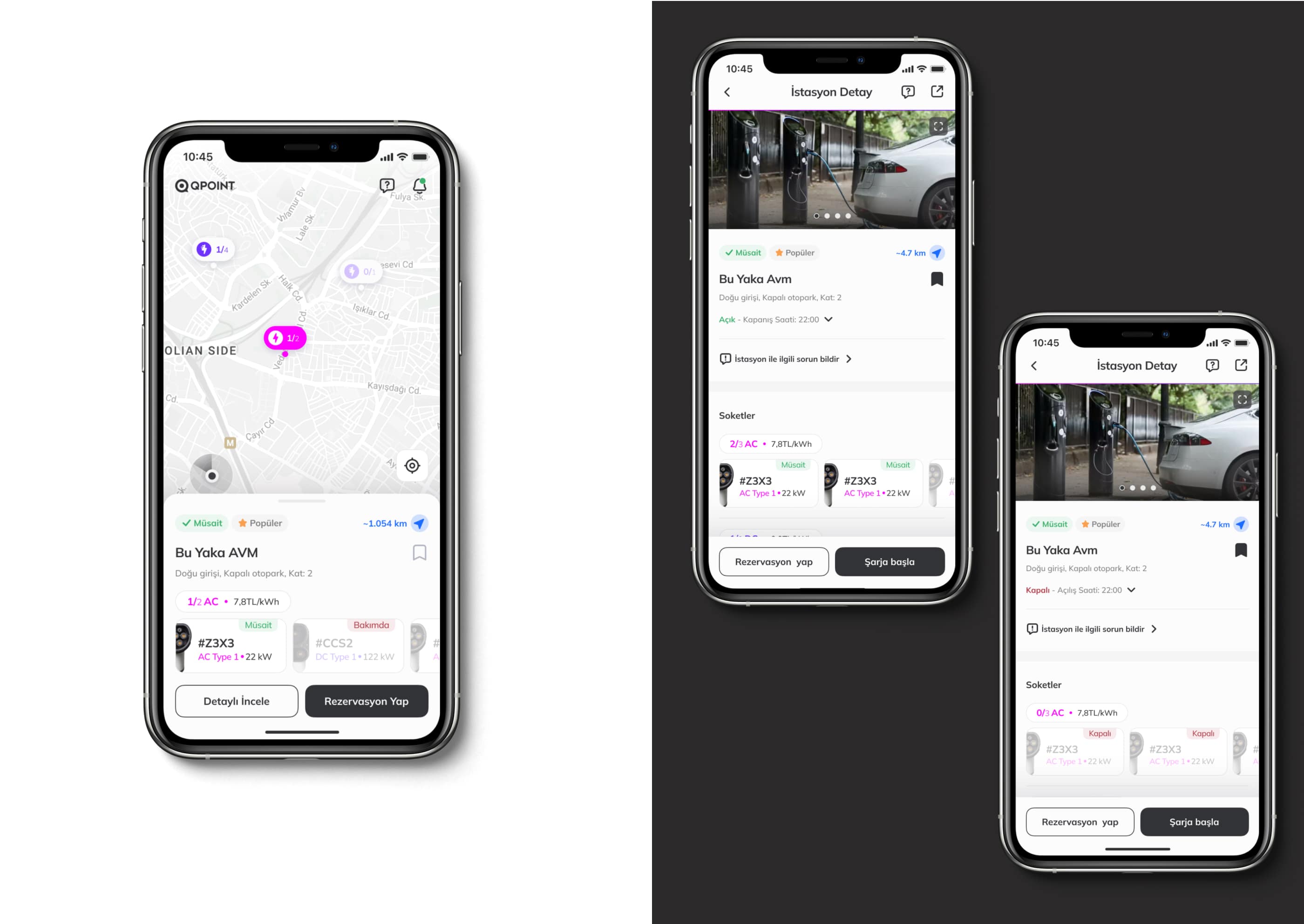
More details about the location can be seen on the station detail page. (Such as station images, working hours, user comments, reporting problems about the place, etc.)
DESIGNS
Creating a Reservation

The reservation is loaded gradually depending on the choices made. Selections such as the date and charging time are clarified. * When the user with the reservation returns to the map, the upcoming reservation is reminded.
DESIGNS
Charging
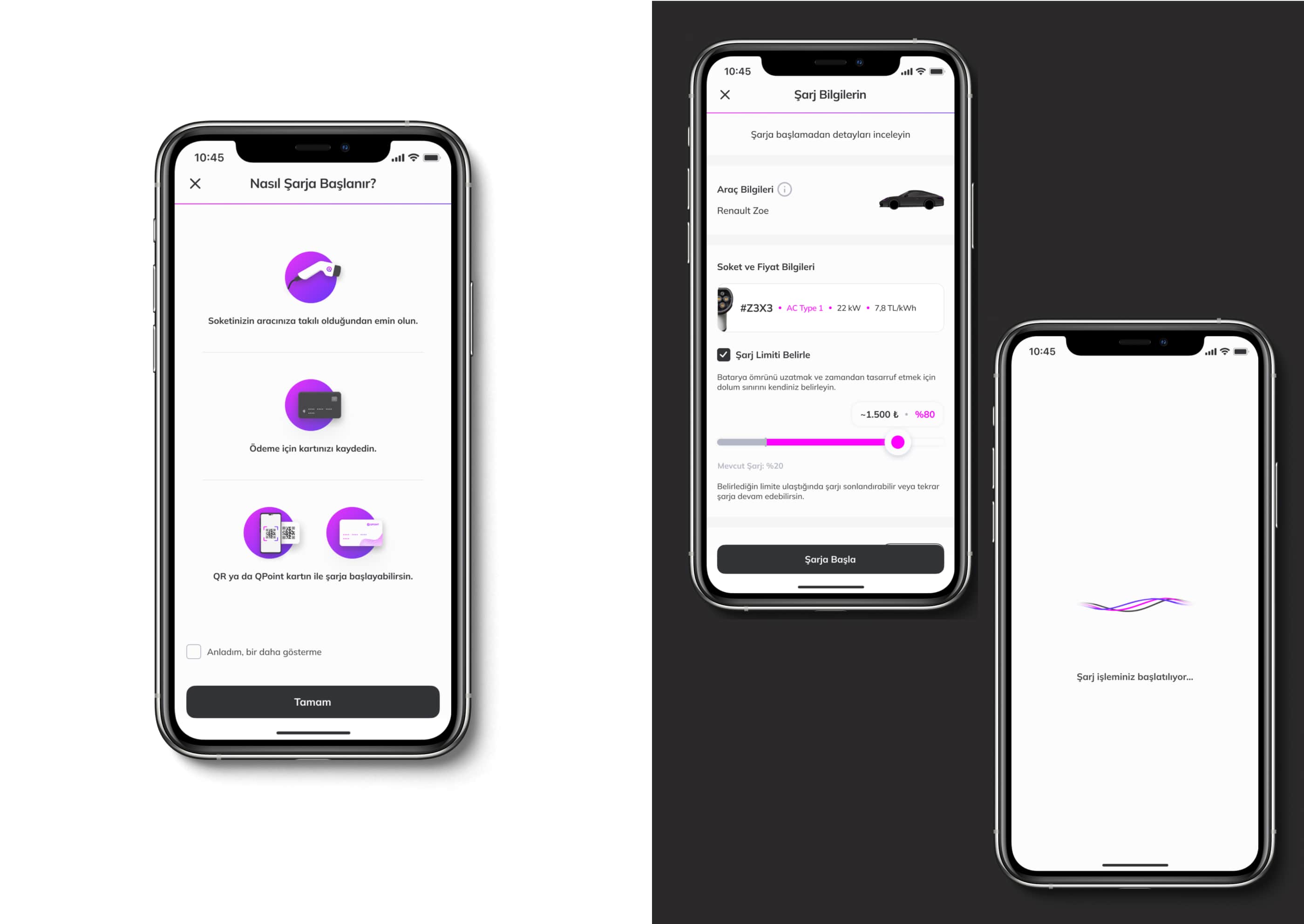
Before charging, the user must ensure that the socket is well inserted and the payment method is registered. The transaction can be initiated with a physical card or QR. (In our research, some users thought the process could only start with a card.) If the user ticks the checkbox, it will be assumed that the user understands this starting flow, and this reminder page will not reappear. Actions such as limit charge percent setting can also be taken before charging.

In the charging process, we have hidden information of secondary importance, such as the start time and percentage, in the "show more" structure. Information such as total loaded actual power, instant charge speed, and charge completion percentage, which the user is interested in during charging, is also given in a larger hierarchy. The red color supports any connection problem during charging.

For the user exiting the charge monitoring screen, the display reminds the continuation of the charge in the bottom menu. (It is valid for users who leave their car to charge, go to eat, shop around, exit the application, and return for follow-up later.)
DESIGNS
Profile

To better understand the user base, we entered the WhatsApp groups of electric vehicle owners and observed that they often shared there. We have also designed a page on the profile page to be shared as a profile summary. It contains registered vehicle and charging information.
DESIGNS
Wallet

DESIGNS
Help & Blog

DESIGNS
Wireframes